DigDash will offer new functionalities in 2021 to improve the ergonomics and design of its software.
On the agenda:
- New functions and dashboard home page templates.
- A more efficient and ergonomic web studio.
- More esthetically pleasing and customizable graphics.
- New plug-in features.
- Export documents in newsletter form.
- A new shared programming functionality on the server side.
New dashboard functionalities
DigDash Enterprise has added new functionalities to make its dashboards more accessible and intuitive for business users.
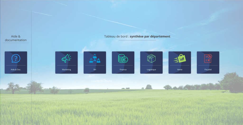
Dashboard home page library
Dashboard interfaces evolve. So thanks to the template library, you can quickly build your dashboard home page and display access icons for each of the user’s roles.
Also, you can now simply order the role tabs on the dashboard pages. To do so, you simply have to indicate the priority level of each role on the user management page.
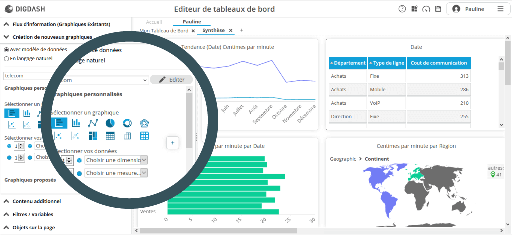
The dashboard creation wizard is evolving
With one eye towards self-service BI, DigDash Enterprise is constantly evolving to become simpler and accessible. Business users can manage their dashboards independently, without needing to use the studio.
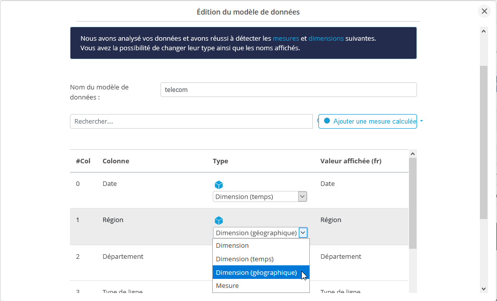
It is worth reminding ourselves that the wizard guides you through the dashboard creation process. It can now also help you to edit data models, as well as calculated measurements previously taken using this method.
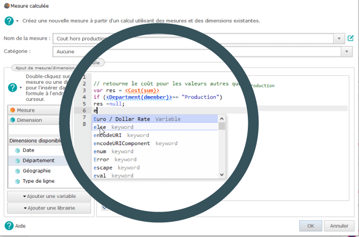
The studio continues to evolve
For our most expert users, DigDash Enterprise’s full web studio continues to evolve, with an overhaul of the calculated measurements editing interface. Many ergonomic improvements have been made: syntax highlighting, copy-paste, keyword suggestion, search, etc.
New-style alert format
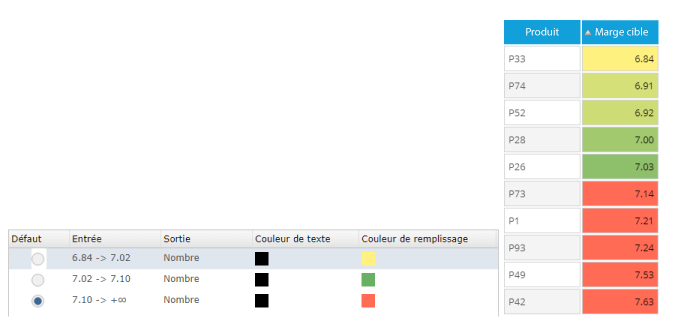
The alert format is now improved, allowing you to highlight the background of cells in a table, depending on the measurement value, display “color” and “icon” simultaneously.
Another new feature: the alert formats also support color gradients. A gradient color scheme can now be applied to the background of cells in a table depending on the measurement value.
Infographics
The icon manager has also been redesigned, which now features infographics that can be used much more easily in graphs. The selection interface now allows you to search, sort or display the different icons by category.
More esthetically pleasing and functional graphics
Improved treemap charts
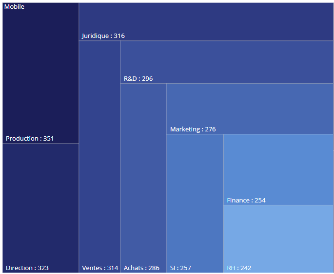
Treemap charts have been improved, now allowing you to display custom labels. The design is now more spaced out, both in terms of the layout and content: borders, texts, display, values, etc.
Logarithmic scales and tooltips
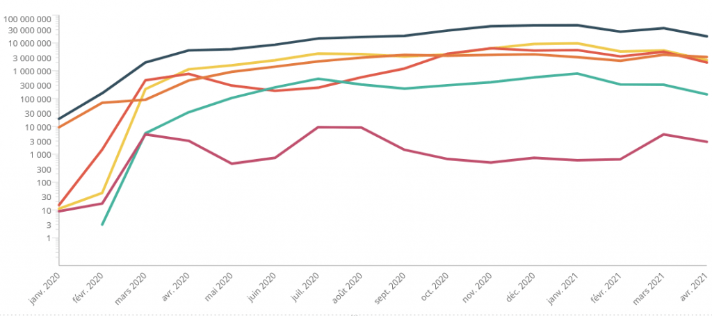
Logarithmic scales can now be integrated into curved graphs, which show data variability at different scale levels.
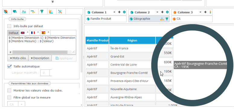
Some tooltips have also been added to simple, cross-tabulation and tree tables to ensure greater readability.
Greater flexibility for document export
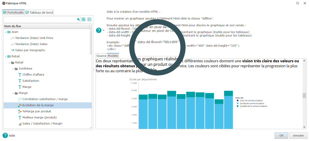
By integrating HTML production, DigDash Enterprise now allows you to create and send newsletters using automatically generated graphics. The system works in the same way as exporting documents in a PDF or PPT format.
You just need to insert a special tag into the HTML code containing the identifiers for the different graphs.
New server-side functionalities
New data-model plug-ins
DigDash Enterprise already supports around thirty plug-ins to integrate your data sources: Excel, JSON, XML, Access MDB, HTML, MongoDB, SQL Server, MySQL, Oracle, etc.
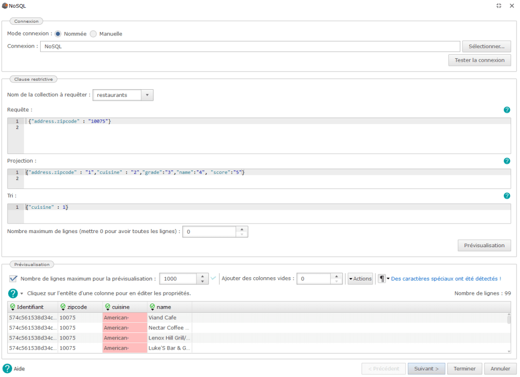
To make data modeling even easier, two new plug-ins have also been added: SharePoint and SAP/Bex. Likewise, it is now easier to build queries (selection of fields to display, sorting, etc.) thanks to the NoSQL interface.
Save updates with shared programming
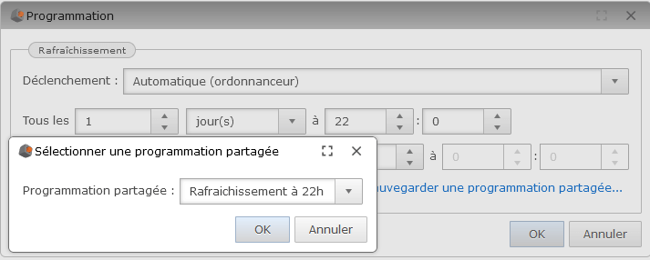
DigDash is now improved thanks to the shared programming feature, which allows you to save updates so that they can be used in other flows or data models.
Simplified configuration for deployment
The configuration file (digdash.properties) is also different in this new version of DigDash, allowing you to set up the entire desired environment. You can now configure the entire deployment at once, rather than during each update.
DigDash Enterprise continues to evolve to better meet everyone’s needs while staying true to its three core values: Agile, Easy & Strong. Thanks to this update, business users will gain greater autonomy in the dashboard creation process, with one eye towards self-service BI. Expert users will benefit from the new advanced functionalities for processing, modeling and presenting data. This will allow you to make more informed decisions by exploiting the full potential of data.
