During this quarantine, DigDash keeps working at full capacity.
We have set up all the necessary tools and communication systems to continue our activity and to offer you, as every year, our new software.
In its 2020 version, DigDash Enterprise integrates a large number of new functionalities that make life easy for the user:
Studio is now available online. Special attention was paid to the Self-service BI and the dashboard.
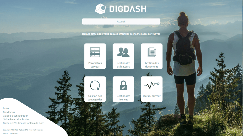
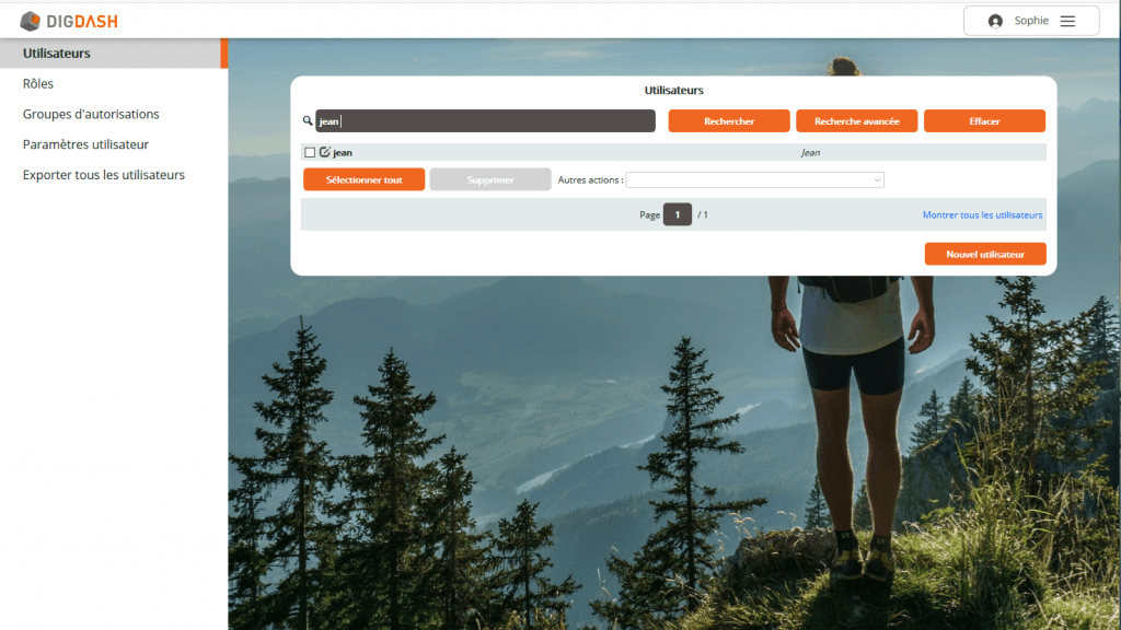
The server also has a new look with new settings pages and a more modern design.
New studio features
Online studio
Studio now offers an interface directly accessible online.
From the homepage, a link to this new ‘web-studio’ interface allows you to set your Data models and charts without having to install the tool onto your computer.
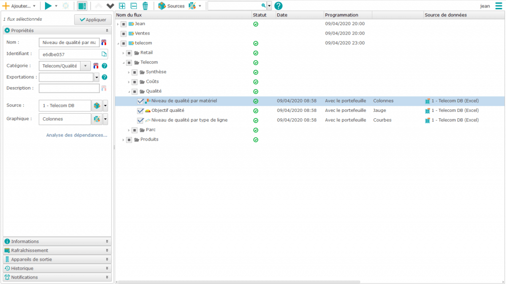
Improved dependency analysis
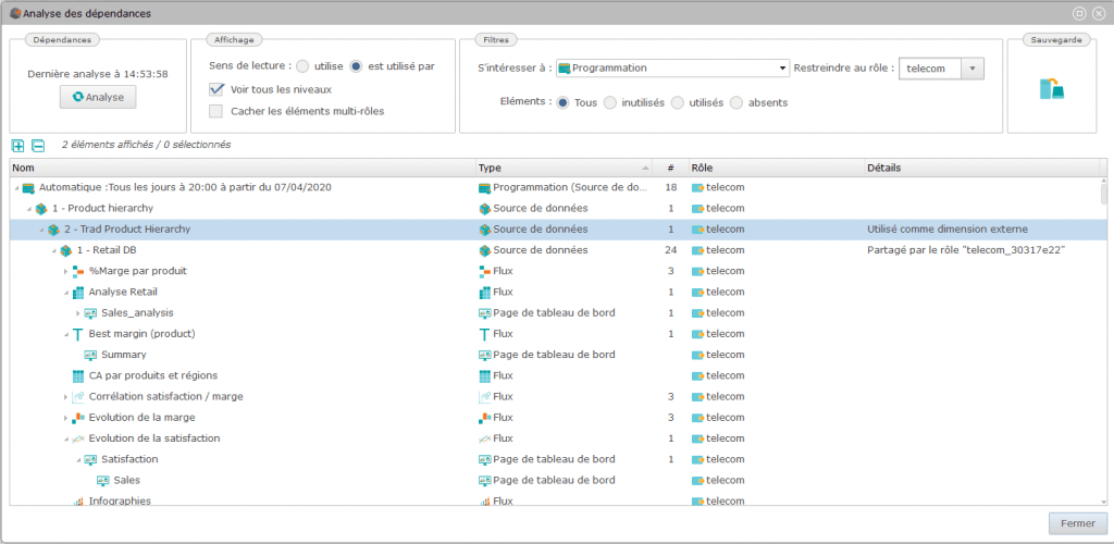
The dependency analysis, also available in previous versions, that enables assessing dependencies between your metadata (formats, measurements…), is more efficient in this new version.
Now, it allows you to analyze dependencies during programming. Thus, you can easily check whether your Data Models and graphs will be refreshed at the desired time.
Addition of a map manager
A new interface, available directly in the Studio, makes it easier to control the different maps and to manage the operations carried out on them (selection, addition, deletion…)
Improved dashboards
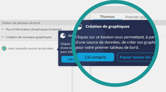
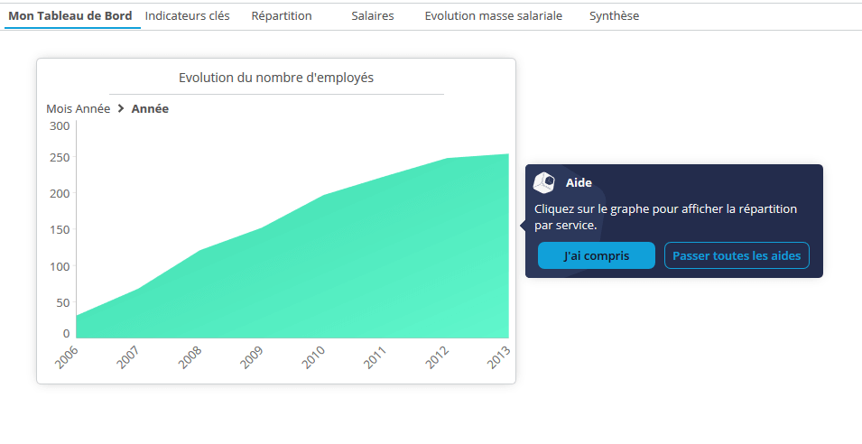
Context-sensitive help is now available when editing dashboards: help buttons are displayed to help you create your first dashboards.
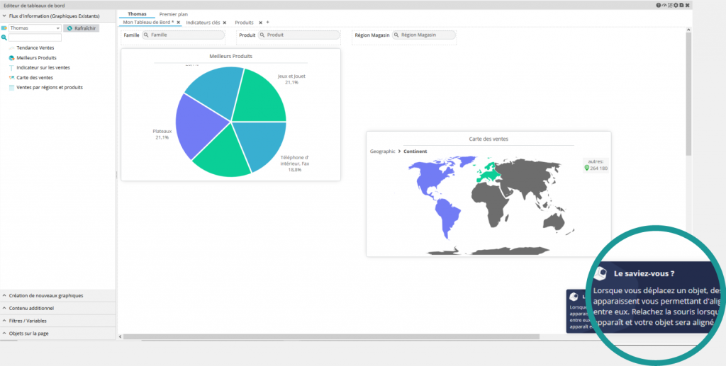
More experienced users can also click on the ‘Did you know?’ button to learn some tips (how to align objects in a page in a simpler way, for example).
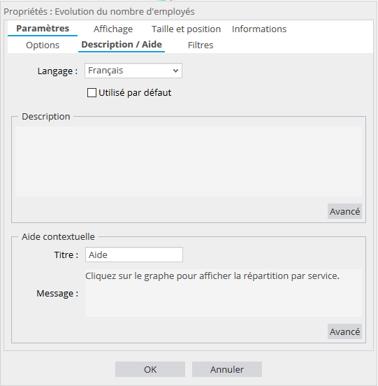
Dashboard designers can also add tooltips to the dashboard display to guide users.
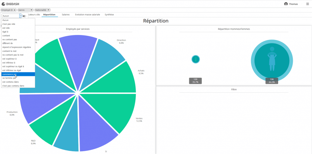
Addition of new types of filters
New types of rule-based filters are available in this new version. A list of keywords displayed in the dashboard allows you to easily create these rules.
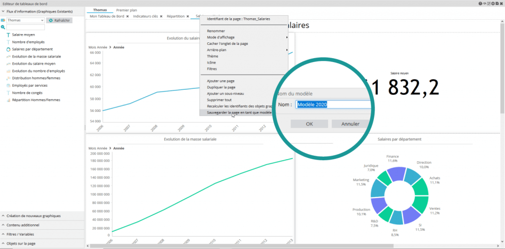
Creation of customized page templates
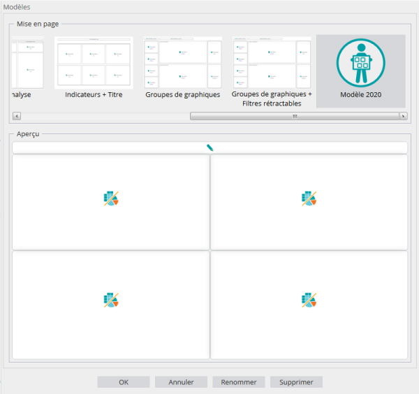
The 2019 R2 version launched in October introduced predefined dashboard page templates, but now you can create your own page templates.
Create your page and save it as a template by right clicking on the page.
While creating a page, simply select the previously created template.
New display formats for groups
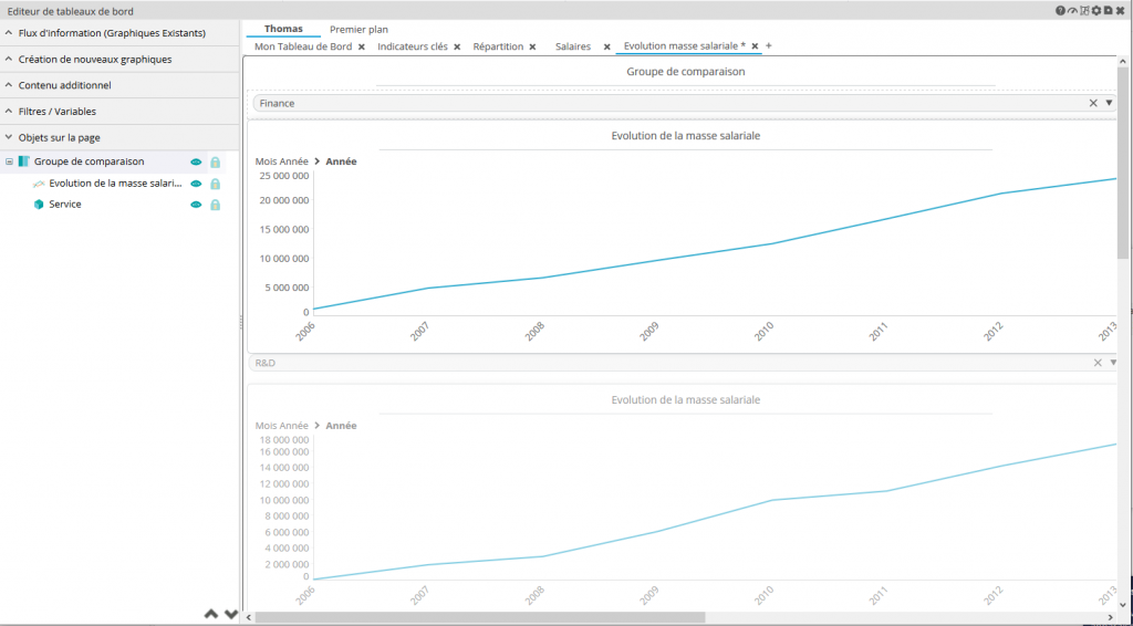
The comparison groups available since the 2018 R2 version enable to compare the same graph by using different filters from the dashboard.
In the 2020 version, the vertical comparative display format complements the horizontal comparative display.
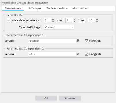
New options have also been added to these comparison groups. This allows you to select the default values for the filters. You can also define whether the user is allowed to modify these values or not by means of a checkbox.
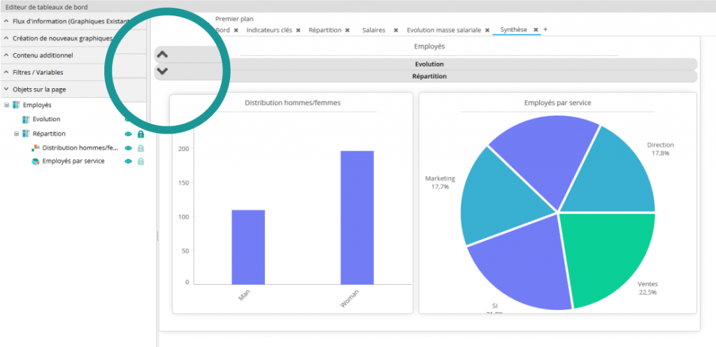
We also offer a new group format that allows you to stack several graphic elements on top of each other.
When displaying the dashboard, you can click to unfold just the item you want to display.
New functionalities in guided analysis
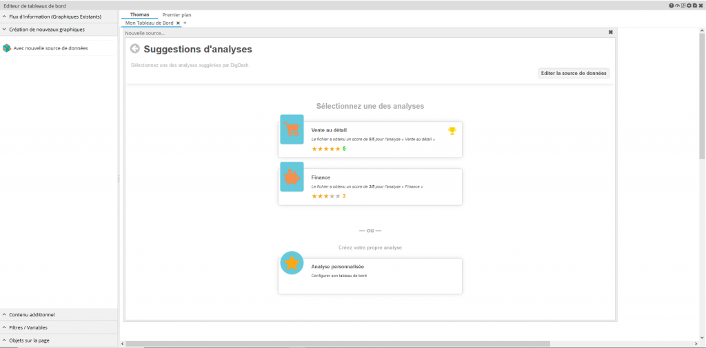
The tool that allows you to automatically create a dashboard from your data file has been improved.
New file formats have been added. Now you can use CSV, XML or JSON files in addition to previously supported Excel files.
The most suitable graphical representations will be suggested based on your file’s data.
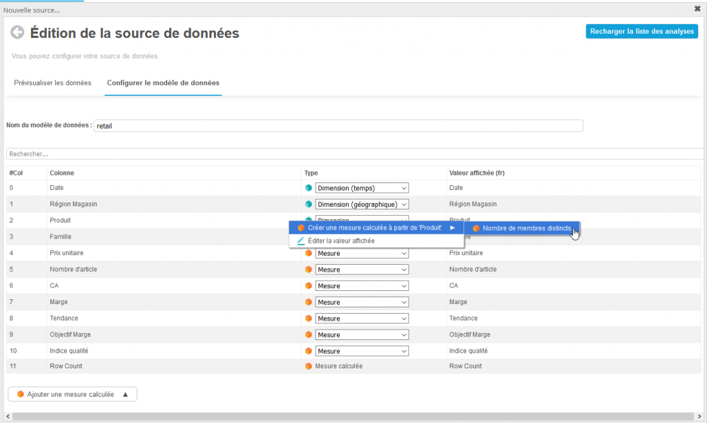
The generated data source can also be modified directly. For example, this allows you to create calculated measurements or modify the dimensions.
Further improved Self-service BI
Self-service BI has been improved.
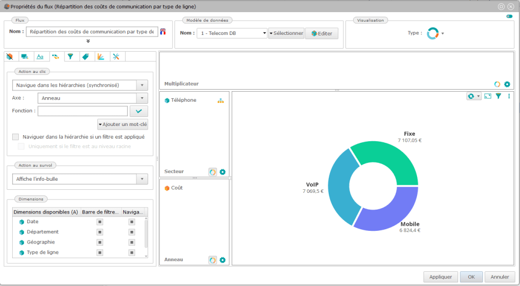
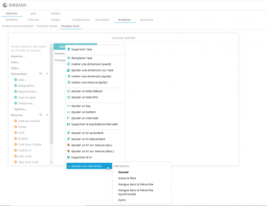
It enables the addition of a number of interactions to an object. To name just a few, you can choose to browse through hierarchies, filters, change pages, open a pop-up graph, etc. You can also add customized features.
Right click to display the options available in a drop-down menu.
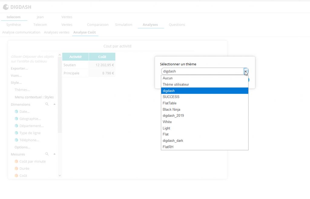
It is also possible to change the style of your graph by applying the theme of your choice from the several themes available.
The style defined in this theme will also be applied to the chart (background, colors, margins, etc.)
The creation of calculated measurements based on dimensions, which was only available in Studio, has also been added to Self-service BI.
Previously, only formulas based on measurements could be created.
Charts with further options available
The OpenStreetMap maps
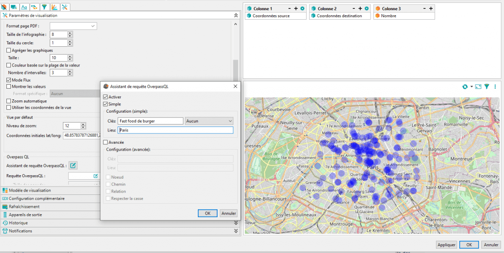
An interface for the creation of OverPass QL queries on the OpenStreetMap database has been added. Requests to display certain elements on your maps, (points of interest, waterways…) can now be performed in a much simpler fashion.
Previously, you had to create these queries in an external tool and then enter them manually into DigDash. The interface is now much more intuitive and saves you a lot of time.
The option to save a default view of your maps, including the desired zoom level and initial display coordinates, is also available.
Evolution on the graphs
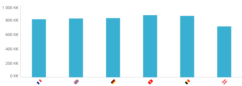
You can now add infographics or icons to the axes of your graphs instead of the usual text descriptions.
This alternative display format enables the creation of clear and fun representations.
Document production is improving
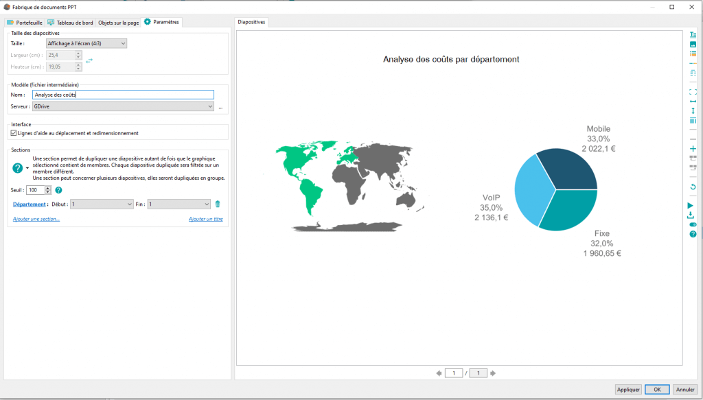
The concept of sections that already existed in the production of PPT documents is now available in the production of PDF documents.
It is therefore possible to replicate elements of a PDF based on the data in the section.
In addition, an interface enabling the easy creation of these sections has been added, whereas in the previous version it was necessary to edit the PPT or PDF document template and enter the information manually.
DigDash Enterprise continues to evolve according to your needs.
In this version, as in the previous ones, priority has been given to the functionalities that you, the users of DigDash Enterprise and experts in your fields, have requested. Now more than ever we are committed to maintaining our relationship with you and developing the agile dashboards solution closest to your needs.
