Data-based marketing, or data-driven marketing, is based on indicators that reflect the performance of each type of action. These are referred to as KPI, or key performance indicators, and are best presented in a way that is understandable at a glance. Choosing the right graphical representation for each indicator is therefore key to facilitate decision-making.
The Value of an Intelligent Dashboard
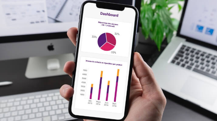
When we speak of Business Intelligence, we mean the ensemble of tools and applications necessary for decision-making. However, defining priorities and arranging information in such a way as to clarify results is not always easy. A dashboard must be intuitive ans agile et agile, and capable of alerting and assessing a situation perfectly if it is to save us time. This is true regardless of the analyst’s competence.
Performance indicator charts also make it possible to read analytical data or, better yet, to visualize them instantly.
Which chart is best given my KPI?
The choice of a performance indicator chart depends on the data to be represented.
Whether in circular, curve, or column format, a KPI dashboard must facilitate an easy reading of statistics or any other information internal or external to the company.
Pie Charts or Half-moon Charts
This example of a KPI chart is widely used to represent percentages including percentage of new customers, one-time customers, and regular customers as a proportion of total customers, etc. The half-moon performance indicator chart is used to convey trends.
Curve or Line Charts
The curve chart is well suited to an easy reading of the statistics in question, allowing for an immediate view of progress over a given period of time and a comparison with any previous period. The line chart is used, for example, to show sales numbers for a product over a six-month, one year, or longer time period.
Histograms and Stacked Columns
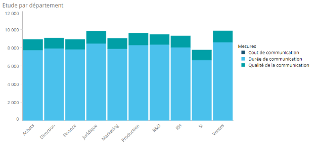
These two graphical representations, made with a variety of colors, provide a very clear vision of the values or results obtained for a product or service. Colors are designated as representing the strongest or weakest progress.
‘Radar’ Charts
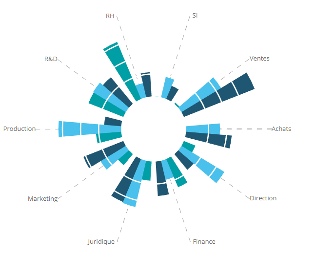
Some dashboard tools offer charts more advanced than the more commonly used representations. The so-called ‘radar’ chart displays your data in a flower shape, and makes it easier to read several KPIs simultaneously. These are a good compromise for understanding at a glance which KPIs are effective and which need to be optimized.
Gauge Charts
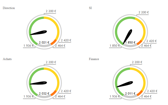
To measure a progress, determine the health status of a KPI or even its evolution, the color gauge chart is the most suitable option. The colors, from green to red, provide you or your collaborators with a very quick understanding of your indicators.
DigDash dashboards are designed for you, and can be adapted to your specific business needs. They will make it possible for you to harness your data and create dynamic dashboards that are user-friendly and easy to understand for your whole team.
DigDash dashboards are designed for you, and can be adapted to your specific business needs. They will make it possible for you to harness your data and create dynamic dashboards that are user-friendly and easy to understand for your whole team.


